")
Listen…
if you’ve been in business longer than five minutes, you’ve probably heard some guru say “You need a landing page.”
And you’re like: Cool, I’ll make a landing page.
So you slap your logo at the top, write a headline in size 18 font, maybe toss in a stock photo of a handshake, and… crickets.
Nobody opts in. Nobody buys. Nobody even scrolls.
Here’s the truth: most business owners butcher their landing pages. And it’s not your fault…you were never trained on how to build one that actually converts. That’s where I come in. I’m a YouTube Consultant who’s spent the last decade building funnels, landing pages, and video strategies for six and seven-figure businesses.
So today, I’m going to show you the exact formula I use with clients. Not theory. Not “bro marketing.” A practical, proven framework you can apply today.
By the end of this article, you’ll know:
- The difference between an offer and a landing page.
- How to pass the 3-second test that makes or breaks conversions.
- Why your buttons are secretly killing your leads.
- And how to add humanity to your page so it feels real, not templated.
Grab a notepad, because this one’s packed. Let’s go.


#1: Know Your Offer Before You Touch the Page
👉 Your offer is what people are getting.
👉 Your landing page is just the delivery mechanism.
So let’s be clear:
- If you’re offering a free lead magnet (like “Get my free YouTube checklist”), your landing page is short, punchy, and designed for speed.
- If you’re selling a $97 mini-course, your landing page is longer, includes testimonials, and likely features a video.
- If you’re selling a $30,000 consulting package, your landing page is a masterclass in persuasion. It might run pages long, and that’s fine.
You wouldn’t sell a Mercedes the same way you’d sell a stick of gum. Don’t make the mistake of treating every landing page the same.
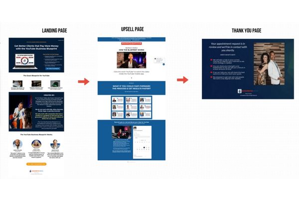
# 2: Funnel Theory for Landing Pages
Here’s what most people forget: your landing page doesn’t live alone. It’s part of a bigger system-a funnel.
Here’s the flow:
- Landing Page → Thank You Page (or Upsell).
This is where someone says “yes” to your offer. Don’t waste that momentum, give them a next step. - Upsell Page → Receipt Page.
The upsell could be a $27 quick-start product, a $97 training, or even just booking a call. - Follow-Up.
Once they’re in, your email system nurtures them with more content, stories, and calls to action.
Think of it like dating. The landing page is where you say “hi.” The thank-you page is coffee. The upsell is dinner. And before you know it, you’ve built a relationship.
Too many people stop at “hi” and wonder why nobody calls them back.
Remember, your landing page is only as strong as the traffic you send to it. That’s where YouTube strategy comes in. By creating silos of related videos, you can dominate search and funnel warm viewers straight into your offers. I explain this in detail in my post on how to rank videos faster using a YouTube silo structure.
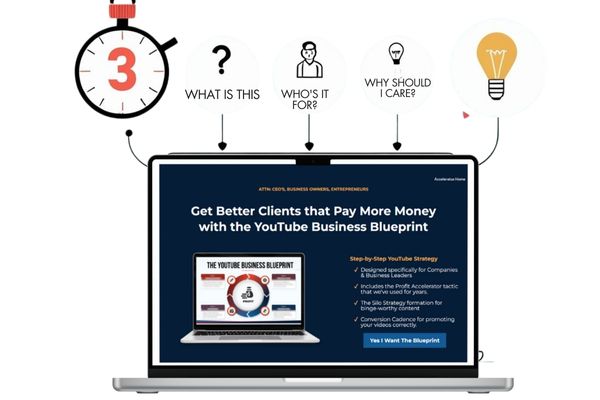
#3: The 3-Second Test That Makes or Breaks Your Landing Page
Here’s a harsh truth: you have 3 seconds to grab someone’s attention. That’s it.
If your page doesn’t immediately answer:
- What is this?
- Who’s it for?
- Why should I care?
They’re gone.
Your first section the top of your page is everything. It should include:
- A tiny preheader (your target market).
- A bold, clear headline.
- An image or video (depending on offer level).
- A call-to-action button above the fold.
Pro tip: ditch the massive logo. Nobody cares about your logo. They care about the promise you’re making.
Think of it like speed dating, you’ve got 3 seconds to make a first impression. Don’t waste it with your company crest.

#4: Images vs. Video on Landing Pages
This is where nuance comes in.
- Free Offers: no video. Why? Because it feels like you’re overselling. Imagine someone at the grocery store checkout begging you to buy gum. Awkward, right? That’s what a video on a freebie feels like.
- Paid Offers: yes video. If you’re asking for money, you need connection. Look into the camera. Talk directly to them. Say, “I know you’re struggling, and I can help.”
And images? Your images sell the offer. Period.
A clean, designed graphic of your PDF will outperform a wall of text every time. Remember, you’re selling the image of your lead magnet, not just the magnet itself.
And here’s the thing, if you’re going to use video on your landing page, you can’t afford to look sloppy on camera. A grainy webcam and bad lighting will tank trust before you even start talking. If you need help dialing in your on-camera presence, check out my full guide on how to look professional on camera so your landing page video makes the impact it should.
#5: Bullet Points That Sell, Not Scare
This is where most pages die: the bullet points.
Too often, I see bullets that sound like homework:
- “Includes 10-page workbook”
- “Comes with 5 video scripts”
Ugh. Sounds like work.
Instead, write bullets that sell value:
- “Unlock the Profit Accelerator tactic we’ve used to grow channels for years.”
- “Learn the Silo Strategy that gets your videos binge-watched.”
See the difference? One makes you groan. The other makes you curious.
And here’s an advanced move: tailor bullets to different audiences. Mention CEOs, lawyers, doctors-whoever you’re targeting. When they see “their word,” they feel like it’s built for them.*-
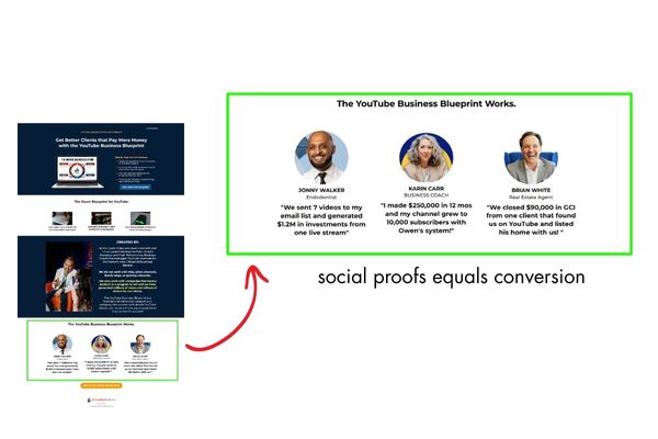
#6: Social Proof That Converts Without Fabrication
Here’s the deal: you don’t need million-dollar testimonials to start.
When I started, my testimonials were things like:
- “Owen is great to work with.”
- “He filmed 25 videos for me.”
Not flashy. But they worked.
Character testimonials (“He’s honest, hardworking”) are powerful in the early days. Later, you’ll have case studies and results.
Pro move: draft testimonials for your clients. Send it over and say, “Does this represent your experience?” Nine times out of ten, they’ll approve it.
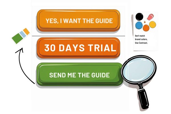
#7: Buttons, Colors, and Conversion Optimization
Let’s talk buttons, the unsung heroes of your landing page.
Here are the rules:
- Top button: marketing-friendly. “Yes, I Want the Guide.”
- Bottom button: transactional. “Send Me the Guide.”
Don’t make your buttons match your brand palette. They need to pop. Contrast is king.
If your site is blue, make your button orange. If it’s black, make your button green. Don’t design for pretty, design for clicks.
And test, test, test. Change one thing at a time: color, text, placement. Run traffic. Data wins.
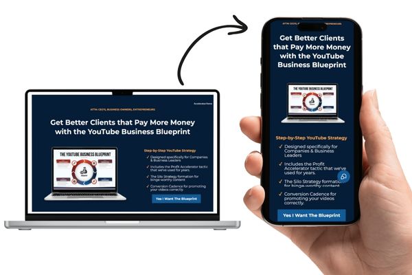
#8: Mobile-First Landing Page Design
(Why 90% of Visitors Will Never See Your Desktop Version)
Here’s a stat that will change how you design: over 90% of your traffic is mobile.
That means if your landing page looks great on desktop but terrible on a phone, you’re losing 9 out of 10 people.
Always design for mobile first. Then adjust for desktop.
Check your page on your phone immediately:
- Is the text wrapping weird?
- Do images look stretched?
- Is the button too small to tap with your thumb?
Fix those first. That’s where the money is.

#9: Keep Humanity on Your Page
Listen, I love AI. But it can also strip your page of humanity.
AI-generated wireframes and copy are fine as a starting point. But if your landing page doesn’t sound like you, people will sniff it out instantly.
If you’re a faith-based coach, let that shine through.
If you’re a luxury consultant, make your page elegant.
Copying Hormozi’s style won’t work if it’s not aligned with your personality.
Bottom line: keep humanity in your page. That’s what connects.
Authenticity isn’t just a buzzword, it’s the growth engine on YouTube and in your funnels. When your landing page feels real, people lean in. Same goes for your content. If you want to see how pros grow fast without losing authenticity, read my article on 5 tips to grow on YouTube fast like Nick Nimmin. It’s a crash course in combining strategy with personality.
#10: Test, Measure, Improve
A landing page isn’t “done.” It’s alive.
Once you launch, run 100 people through it. See what happens.
- If nobody clicks, change the button.
- If people click but don’t convert, adjust your bullets.
- If people bounce at the top, rewrite your headline.
Landing pages are built through iteration. You don’t guess, you test.
Watch the Full Training
Now, if you’re the kind of person who loves to see it instead of just reading about it, I’ve got you covered. I walked through all of this step by step, live on camera, showing you real examples and layouts.
👉 You can watch the whole video here on YouTube and see exactly how I build high-converting landing pages in real time.
Why Every Great Landing Page Needs a YouTube Consultant
A perfect landing page:
- Passes the 3-second test.
- Clearly communicates the offer.
- Uses real, relatable social proof.
- Has buttons that actually get clicked.
- Looks flawless on mobile.
That’s it.
Less is more.
And if you want help? That’s where I come in. As a YouTube Consultant, my team builds these landing pages every day. We help businesses design pages that don’t just look good, they convert strangers into subscribers, viewers into leads, and leads into clients.
Because when you do this right, you’re not just making a page. You’re building the front door to a system that scales authority, trust, and revenue.
And if you’re serious about growth, let’s talk. Because the perfect landing page is waiting for you.
One last thing, your landing page isn’t the only video-powered asset your business needs. In fact, there are seven types of videos every company should have in their toolkit, from testimonials to explainer videos. I lay them all out in my article on 7 essential videos every company needs.